Make matplotlib histograms look like R's
I prefer the look of R's histograms. This short post pulls together some resources for mimicking R histograms in Matplotlib.
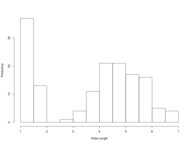
This is the look I want, the histogram from R:
data("iris")
png(filename="../files/site_pics/R_histogram.png", height=600, width=800)
hist(iris$Petal.Length, xlab="Petal Length", main='')
dev.off()
In python's matplotlib we can also plot the histogram using the defaults:
import matplotlib.pyplot as plt
import seaborn as sns

plt.style.use('default')

plt.figure(figsize=(8,6))
df = sns.load_dataset('iris')
df.petal_length.hist()
plt.xlabel("Petal Length")
plt.ylabel("Frequency")
plt.savefig("../files/site_pics/MPL_histogram.png")
plt.show()
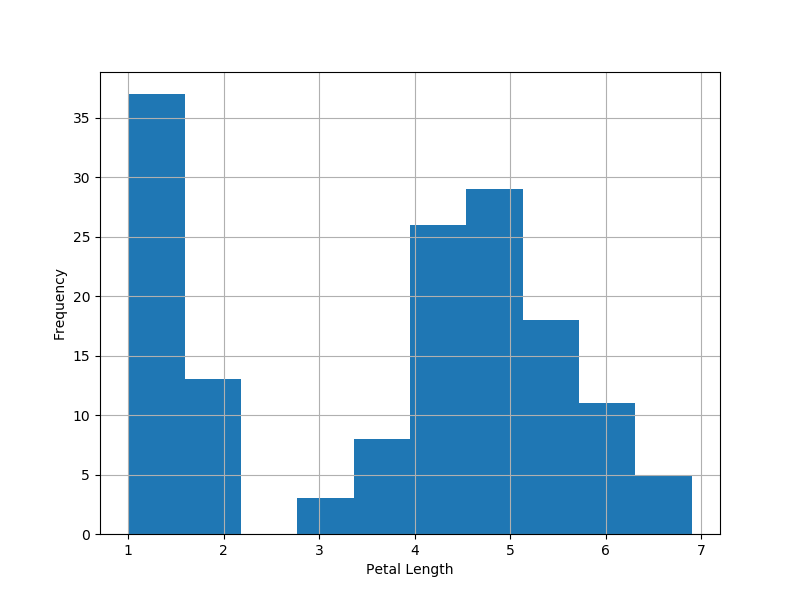
That's not going to cut it. Admittedly, there are some minor improvements we could make (e.g. change the style, get rid of the grid lines, add edgecolors, etc). However, this falls short of the look I want.
Tweaking Matplotlib
My focus here is on black and white figures that will look good in
manuscripts and I want to mimic the R look. To accomplish that,
- Begin with a nice black and white style chosen from https://matplotlib.org/gallery/style_sheets/style_sheets_reference.html. Preferably, one that has tick mark and other features closer to the aesthetic you want to achieve.
- Turn the frame and grid lines off
- Tweak the x-axis so that there is a gap with the y-axis, which seems more appropriate for histograms
- Have color options allowing for separation between bins
The following function accomplishes the R histogram look in
matplotlib and offers some options options (and has decent default
values) for furhter customizations over the R default
histogram.
def Rhist(x, bins=None, xlab='', savename='', color='w', edgecolor='k', figsize=(8,6), offset=5):
    """
    Makes histograms that look like R
    Inputs:
    - x: a numpy array or pandas series
    - bins: number of bins, default (None) is mpl default
    - xlab: text label for x axis, default '' (empty)
    - savename: full name and path of saved figure,
      if '' (default) nothing saved
    - color: fill color of bars, default 'w' (white)
    - edgecolor: outline color of bars, default 'k' (black)
    - figsize: width, heighth of figure in inches (default 8x6)
    - offset: how far to separate axis, default=5
    """
    plt.style.use('seaborn-ticks')

    def adjust_spines(ax, spines, offset):
        """
        This is mostly from
        https://matplotlib.org/examples/pylab_examples/spine_placement_demo.html
        """
        for loc, spine in ax.spines.items():
            if loc in spines:
                spine.set_position(('outward', offset))  # outward by offset points
                spine.set_smart_bounds(True)
            else:
                spine.set_color('none')  # don't draw spine

        # turn off ticks where there is no spine
        if 'left' in spines:
            ax.yaxis.set_ticks_position('left')
        else:
            # no yaxis ticks
            ax.yaxis.set_ticks([])

        if 'bottom' in spines:
            ax.xaxis.set_ticks_position('bottom')
        else:
            # no xaxis ticks
            ax.xaxis.set_ticks([])

    fig = plt.figure(figsize=figsize)
    ax = fig.add_subplot(1,1,1)
    ax.hist(x, bins=bins, color = color, edgecolor = edgecolor)
    adjust_spines(ax, ['left', 'bottom'], offset)
    ax.set_xlabel(xlab)
    ax.set_ylabel('Frequency')
    plt.tight_layout()
    if len(savename)>0:
        plt.savefig(savename)
    plt.show()
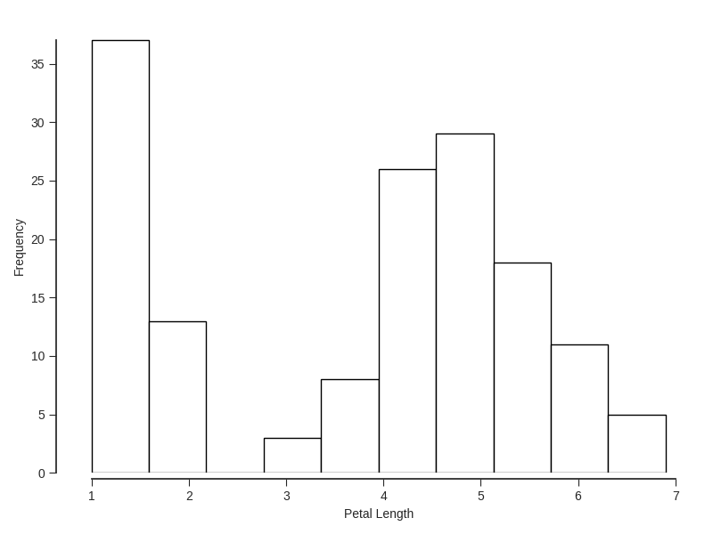
For example, the R default:
Rhist(df.petal_length, xlab = "Petal Length", savename = '../files/site_pics/Rhist_R_default.png')
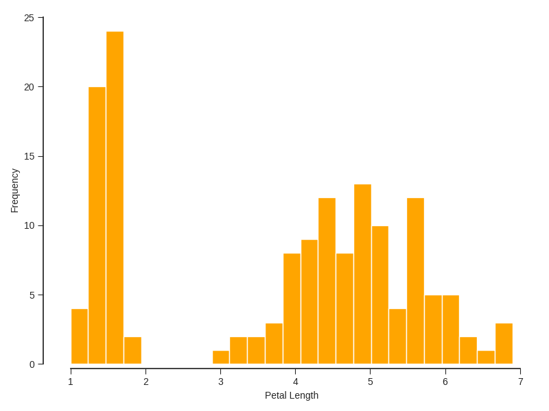
Or, if we want to use colors (e.g. orange colored bars with white edges) and add bins:
Rhist(df.petal_length, bins=25, xlab = "Petal Length", color= 'orange', edgecolor='w',
      savename = '../files/site_pics/Rhist_orange.png')